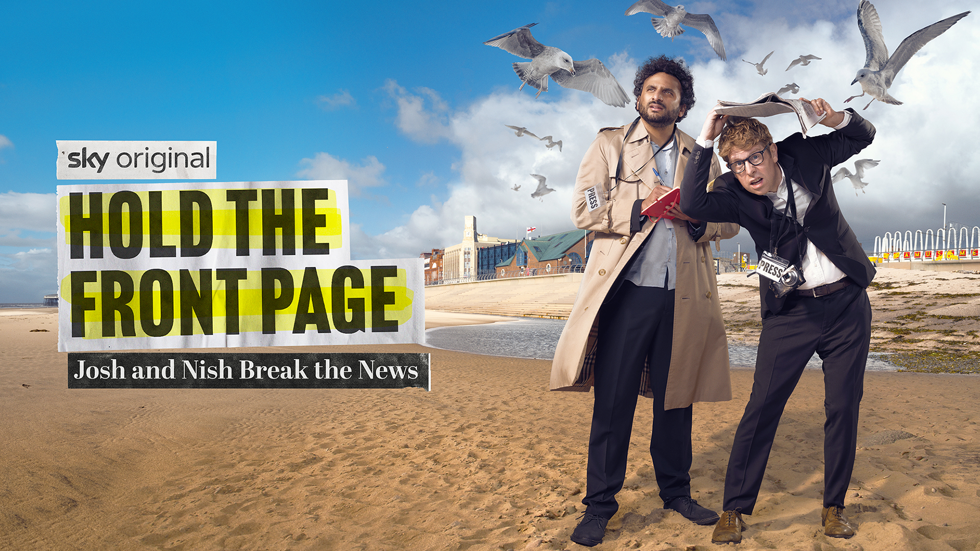
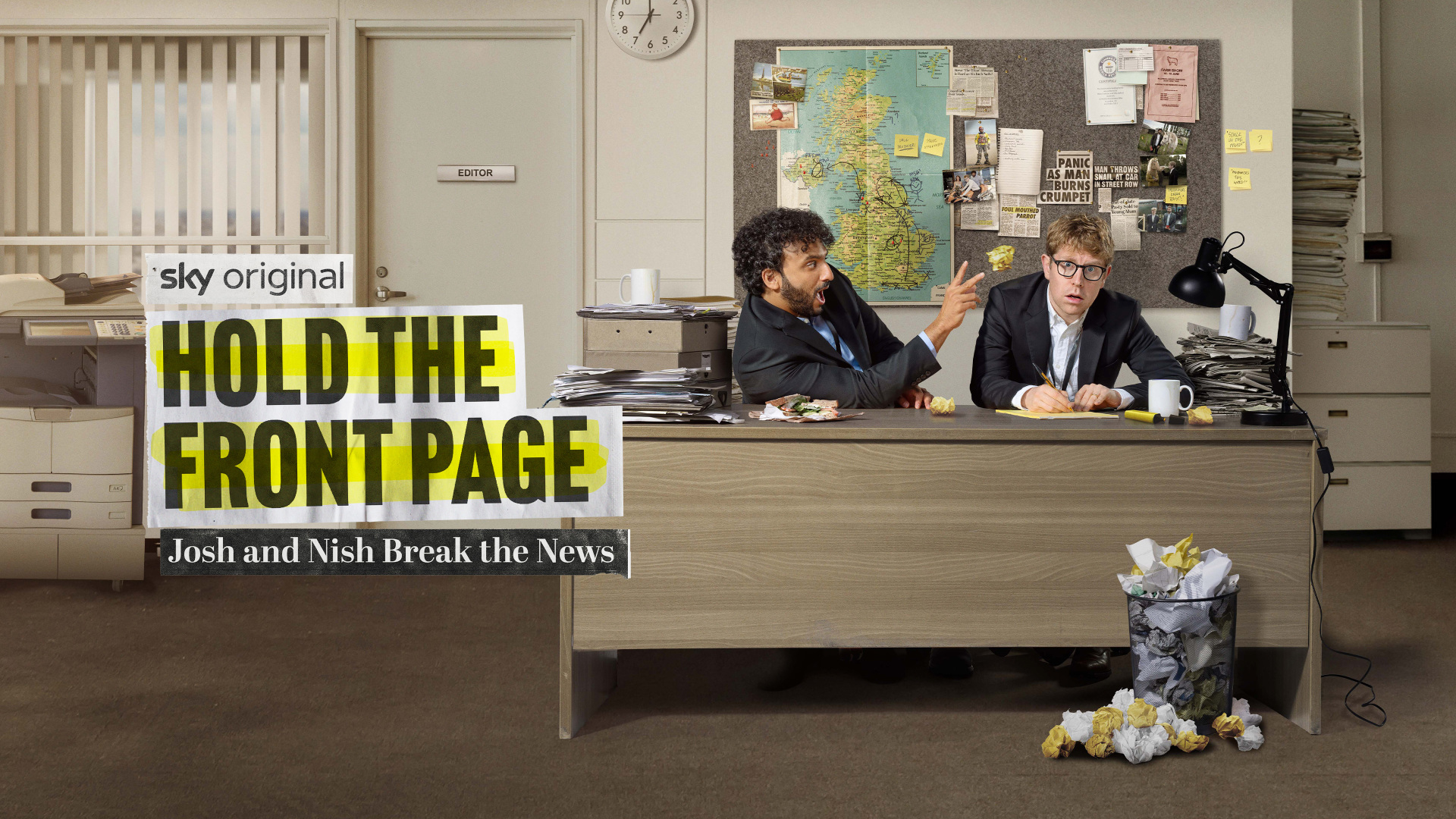
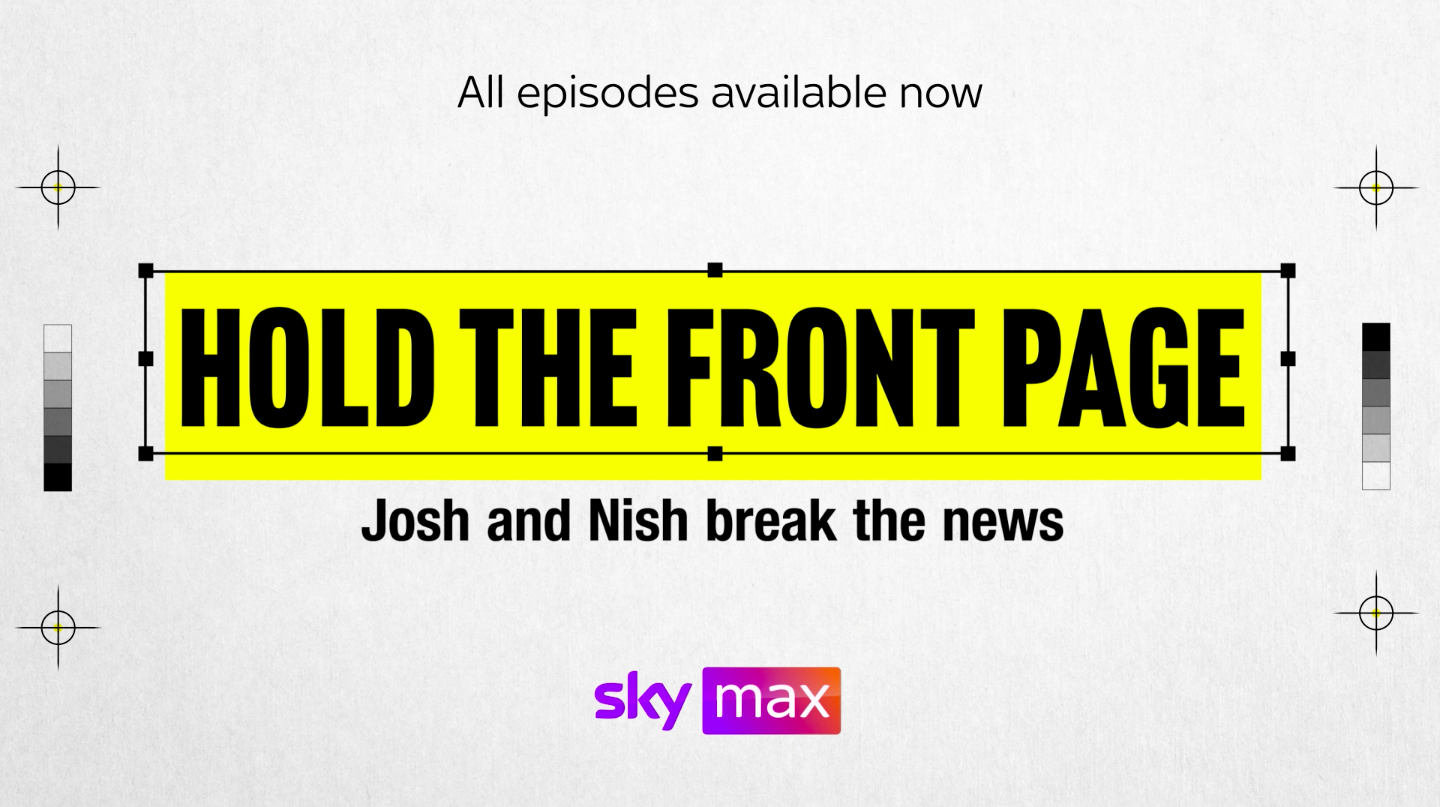
HOLD THE FRONT PAGE
JOSH AND NISH BREAK THE NEWS
So this campaign, built around a series where Josh Widdicombe and Nish Kumar, comedians-slash-cultural-tourists, embed themselves in local UK newspapers (those quaint, dying beasts), became a kind of elegy to print itself.
I built it out into a full campaign, with OOH key visuals, a motion/static identity system, and a tone that straddled satire and sincerity. The branding mirrored the medium’s evolution, from parochial print to digitised feeds, making it both nostalgic and sharp. It wasn’t just a promo; it was a visual thesis on how news has drifted from the smell of ink to the ping of push notifications. With jokes.
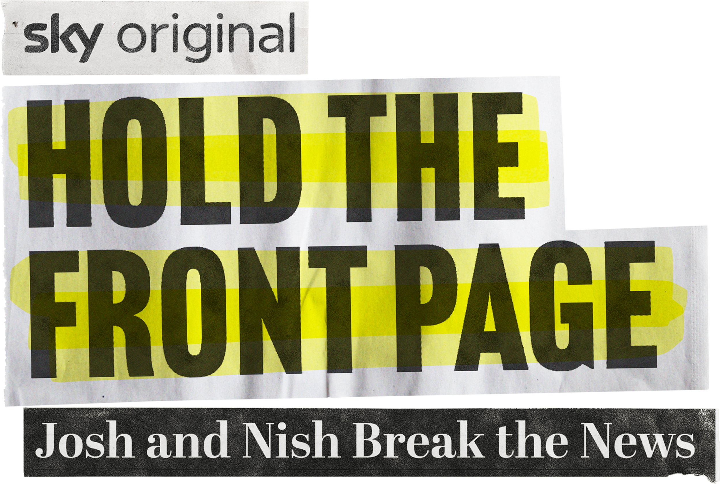
TYPE TREATMENT
We knew we wanted to yank the tweedy soul of old-school news into the digital world of now, but the form eluded us. Then, printing press textures became editorial icons, cursors, and text boxes. anachronism meets interface. The title treatment became our lodestar. modular, floaty, endlessly overlayable. A visual bridge between typewriter clack and algorithmic scroll.
MOTION
Agency: Sky Creative
Photographer: GARY SALTER
Creative director: JOHNNY ACE
Art director/designer: Charles Bignell
DESIGNER: TILDA RAWLS
MOTION: THEA KOUTAS